Fluid Font CSS Clamp & Calc
Why Use clamp()?
- Design Flexibility: It allows for fluid, flexible layouts without requiring multiple media queries for precise element sizing.
- Control Over Extremes: By specifying minimum and maximum sizes, you can prevent your design from breaking at extreme viewport sizes.
- Viewport Responsiveness: Combining
vwwith other units makes your layouts responsive to viewport changes while keeping values within safe boundaries.
Example
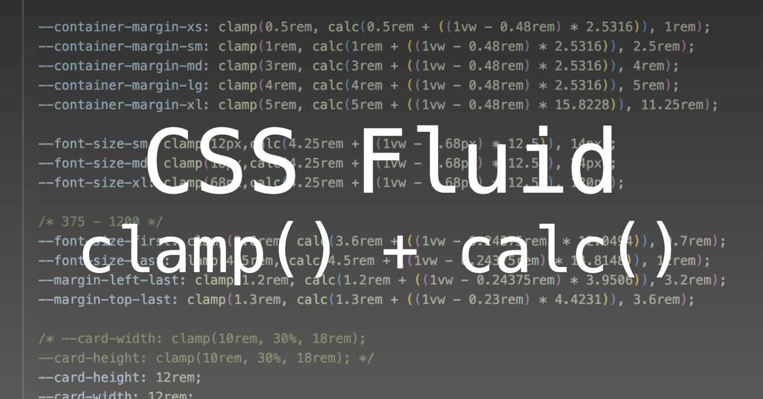
The clamp() function in CSS allows you to set a value that is constrained within a defined range. In the snippet clamp(4.5rem, calc(4.5rem + ((1vw - 0.24375rem) * 14.8148)), 12rem);, this means that the value will dynamically adjust between a minimum (4.5rem), a preferred calculation (the result of the calc()), and a maximum (12rem).
Breakdown:
Minimum Value:
4.5rem- The value will not shrink below
4.5rem, no matter the screen size.
- The value will not shrink below
Preferred Value:
calc(4.25rem + ((1vw - 0.24375rem) * 12.5))- This part is the heart of the dynamic calculation:
4.25rem: A base size that scales with the root font size.1vw: A viewport-based unit, where1vwequals 1% of the viewport width. This helps scale the value based on screen size.0.24375rem: A value that is subtracted from the viewport unit to offset the size scaling, likely to maintain consistency with typical viewport breakpoints (768px is often a breakpoint for tablets).* 12.5: Multiplies the adjusted viewport width to amplify the dynamic effect.
This calculation results in a value that grows/shrinks based on the viewport size, but it’s constrained by the minimum and maximum values defined by
clamp().- This part is the heart of the dynamic calculation:
Maximum Value:
12rem- The value will not grow larger than
12rem.
- The value will not grow larger than
Use Cases:
- Responsive Typography: The
clamp()function is often used to create responsive typography that scales smoothly between different screen sizes. This can ensure that text is neither too small on mobile nor too large on large desktops.1 2 3
h2 { font-size: clamp(1rem, calc(1rem + (1vw - 7.68px) * 2), 2rem); }
- Responsive Component Sizing: Components such as buttons or cards can adjust their size based on the viewport, ensuring that they are large enough for touch devices but don’t overwhelm the layout on larger screens.
1
2
3
button {
 font-size: clamp(1rem, calc(1rem + (1vw - 7.68px) * 2), 2rem);
}
- Maintaining Readability: The
clamp()function ensures that elements like headings or paragraphs maintain legibility across a wide range of devices. The dynamic calculation allows for fine control, while the minimum and maximum bounds prevent extremes that would harm usability.
This post is licensed under CC BY 4.0 by the author.
